Real User Monitoring
Location Based Insights
Auditzy™ RUM provides insights into the geographical location of visitors accessing your website. This data is crucial for understanding the performance of your website across different regions and optimizing it for a global audience.
World Map Overview
The World Map Overview offers a visual representation of the distribution of website visitors across different countries. This map provides a high-level perspective of the geographical distribution of visitors and their corresponding performance metrics.

The World Map Overview allows users to:
View the distribution of visitors: The map displays the distribution of website visitors across different countries, providing insights into the geographical reach of your website.
Analyze performance metrics: Users can analyze performance metrics such as Largest Contentful Paint (LCP), Cumulative Layout Shift (CLS), and Interaction to Next Paint (INP) across different regions.
Identify performance variations: By examining performance metrics across different regions, users can identify performance variations and potential areas for optimization.
Metric Filters, Desktop/Mobile/All Toggle and Percentile Dropdown (25th, 50th, 75th, 99th) allow users to customize the data displayed on the World Map Overview.

The Red, Yellow and Green color codes on the map are based on the metric based performance ranges i.e. For TTFB the Good (Green) range is 0-800ms, Need Improvement (Yellow) range is 800-1800ms and Poor (Red) range is above 1800ms.
On the right side of the World Map Overview, there are several data points to look at, let's break them down:
Metric Details
This card offers information on country-specific performance metrics. For example, the p75 TTFB (75th percentile Time to First Byte) for India over a three-month period is 0.41 seconds. Additionally, it displays the overall p75 TTFB metric for the selected device.

Total Page Views
This card provides insights into the total number of page views from visitors in the selected country.

Metric Specific User Experience Distribution
This card categorizes user experiences based on performance metrics. It classifies user experiences into Good, Needs Improvement, and Poor categories based on the specified metric and gives an understanding of how users in the selected country experience the performance of the website.
For ex. In the below example 90% of users in India experience a Good TTFB, 7% experience Needs Improvement, and 3% experience Poor TTFB.

Country City Level Insights
Country City Level Insights is a detailed view of the performance metrics of visitors from different cities within a selected country.
This view provides a granular analysis of performance metrics at the city level, allowing users to identify performance variations across different cities.
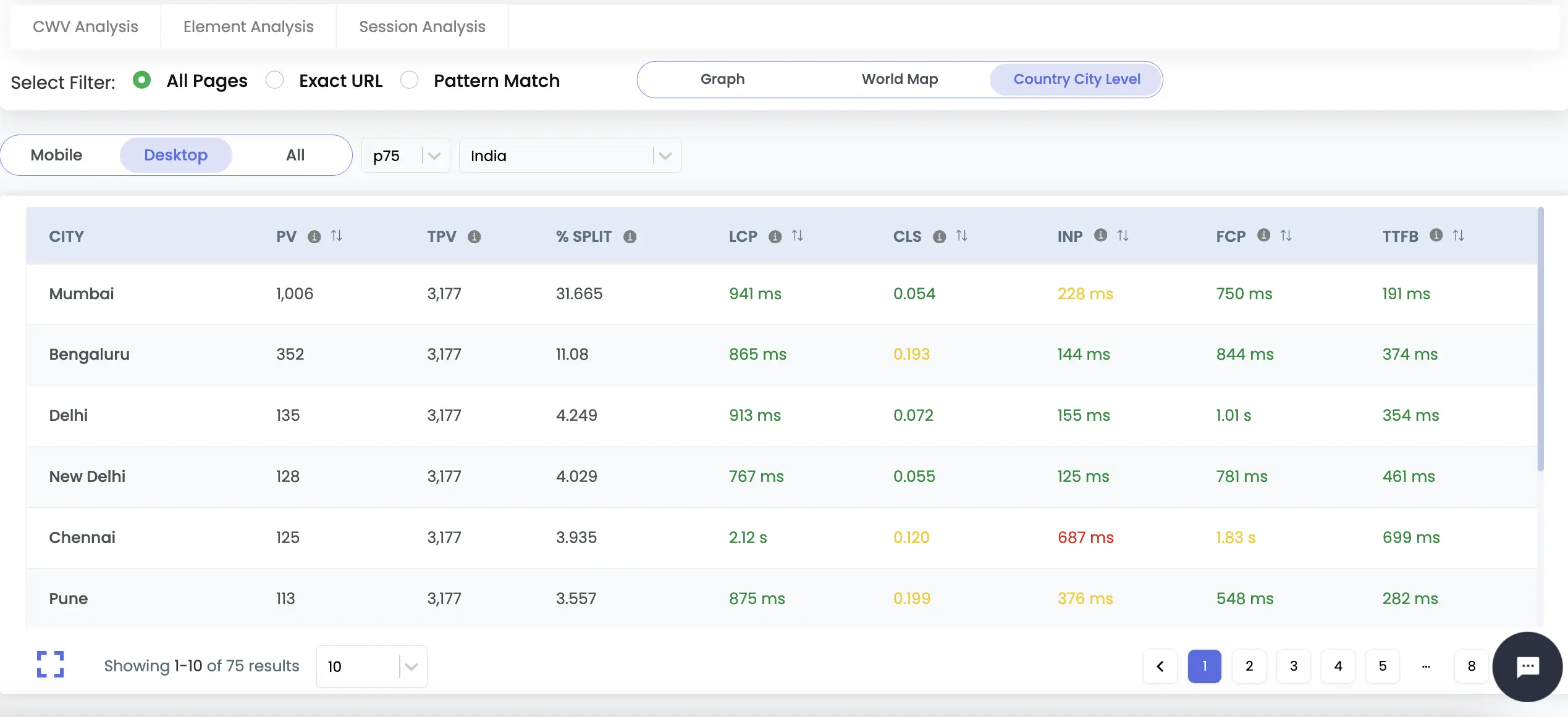
Mobile/Desktop/All Toggle and Percentile Dropdown (25th, 50th, 75th, 99th) helps to customize the data and analyze performance metrics for visitors from different cities within the selected country. By Default City with the most page views comes at the top.
The %Split data gives insights into which city contributes the most to the total page views for the selected country so that businesses can focus on optimizing the performance for these cities.
Got Questions or Need Help?
For any inquiries or support related to Auditzy's Real User Monitoring (RUM) setup, configuration or understanding data, please don't hesitate to contact our support team.
Would you like to see a demo of our product? We're here to help you achieve your goals effectively.
Explore Auditzy Today
Start monitoring your website performance with Auditzy, or run a Free Historical Core Web Vitals Test today.